Proenza Schouler Store
New York, USA
- Status
2012 - Size
279 m² / 3,000 ft² - Category
Commercial, Interiors - Design Architect
Adjaye Associates - Architect of Record
A.S III Design Studio - Client
Proenza Schouler - Facade Consultant
Buro Happold - General Contractors
Apogee Construction - Lighting Consultant
Focus Lighting - Mechanical/Plumbing Engineer
Perfectaire Company - Structural Engineer
Buro Happold
Technical Info +
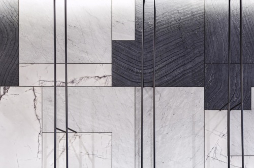
Throughout the space, there is a mix of familiar materials, used in uniquely defined ways. It could be said that this is also part of the Proenza Schouler design for fashion.
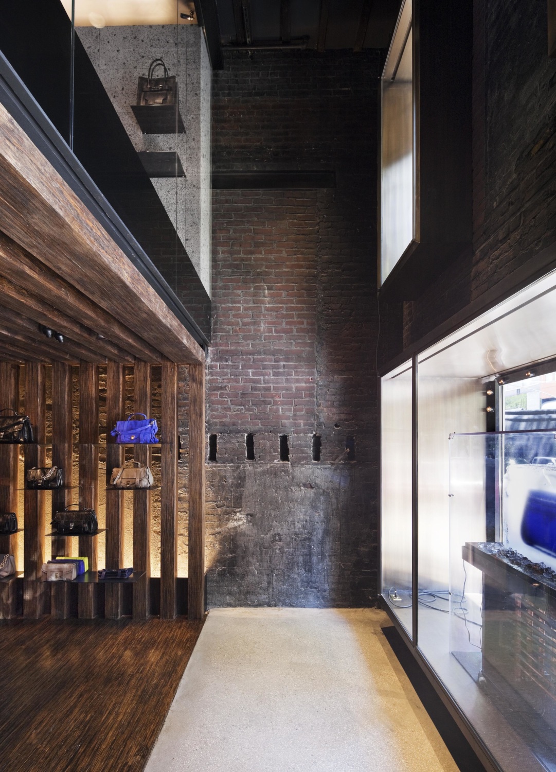
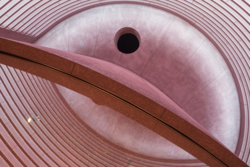
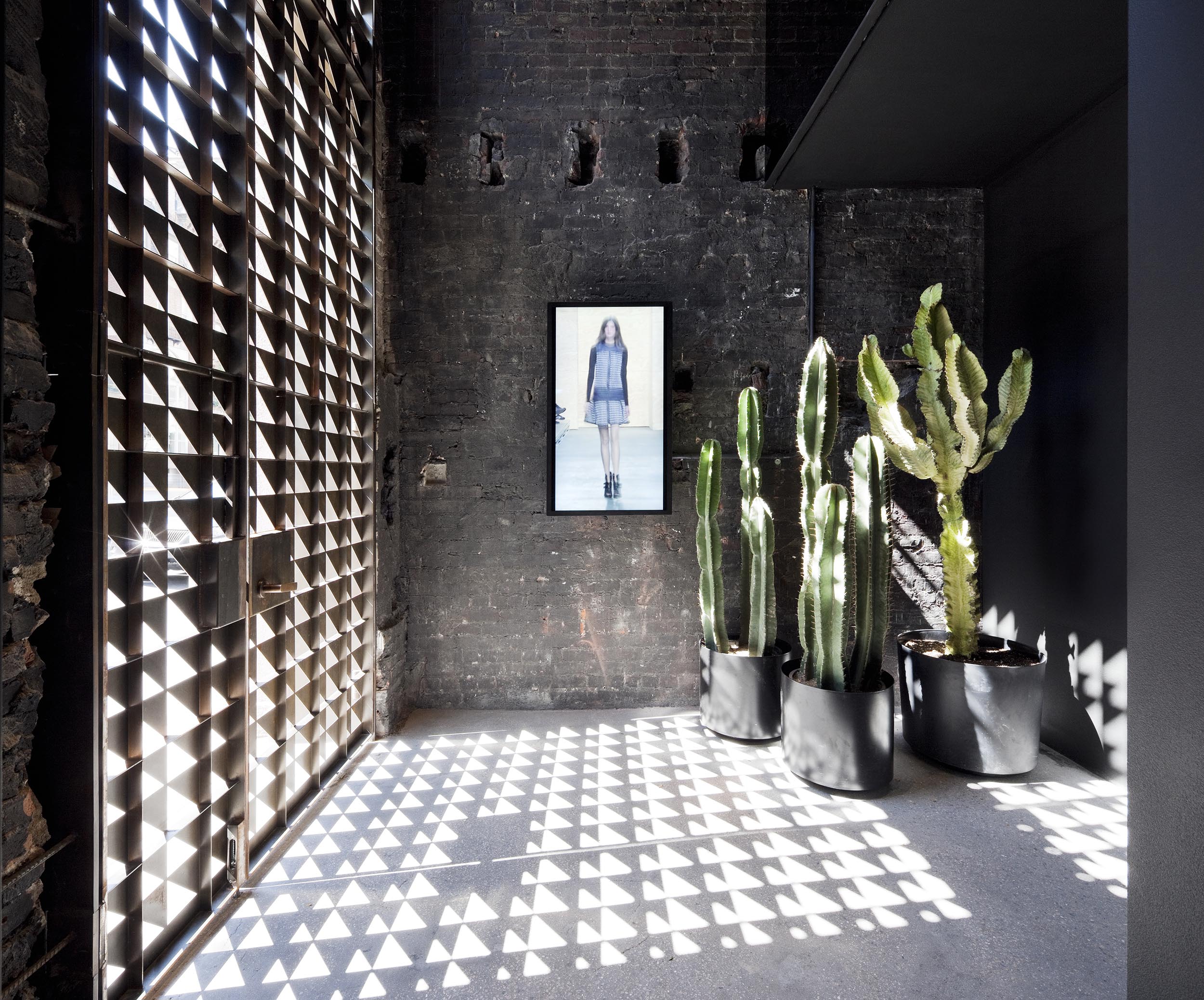
The space comprises two distinct retail zones – ground floor and second floor. The zones are flanked by 2 storey “relief” volumes at each end. The ground floor, which hosts small leather goods and handbags, is grounded by the timber walls and ceiling. The porosity of the timber members allow the existing building to read as the host of the inserted timber pavilion. Leaving the timber area, space continues to a simple ground face concrete masonry unit wall that was part of the old building language. In this two storey chamber, the bronze screen serves as a visual focus and a cellular filter in and out of the stair path.
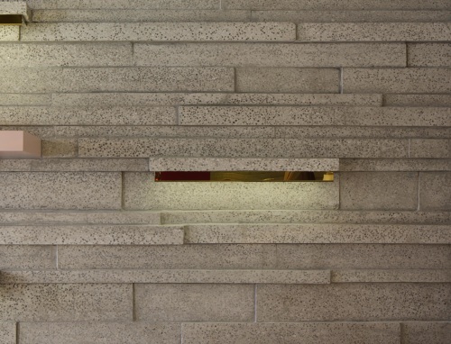
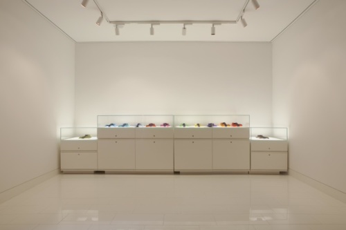
Clients are greeted on the second floor with the vivid colours of the Proenza Schouler ready-to-wear collection, contrasted against the neutral and familiar backdrop of precast concrete. Throughout the space, there is a mix of familiar materials, used in uniquely defined ways. It could be said that this material mixing is also part of the Proenza Schouler design for fashion, in which the seam stitching, re-use of fabric in unconventional methods, and composition of prints is all part of the language.
